Posts tagged Process and Inspiration
PODCAST Season 1, Episode 5, “ODE TO TOM”.

Tom Thomson’s iconic Jack Pine image is reversed in this painting as a nod to the idea that Down under means upside down

Ode to Tom Detail 1

Collecting visual data for this composition included some home grown eucalyptus leaves

I love the personality of this bundle of gum leaves. Their shapes helped to contain the action of the various elements within the composition.

This week on the Podcast we take a walk down Memory Lane where I introduce you to a mixed media painting on paper from the earliest days of my studio practice. We chat about my tendency to paint like a printmaker, about gathering visual ideas and why I included some of the images that I did. North meets South as we meet at the imaginary place where universal flatlands become coastal and inland oceans and nocturnal auras and painterly signatures merge in colour and process.


Opposite my “Painted Ladies” in our dining room lives an “Ode to Tom”. This was one of my very early works in mixed media, an acrylic and chalk pastel on water colour paper, with eucalyptus leaves, 22 1/2” x 30”

Tom is a ladies man and “the Painted Ladies” opposite enjoy the view. Together they act as foils reflecting aspects of the past and the present to each other. Painted in 2001 this piece was an image that grew as a collage would by compiling a group of thoughts graphically into a single image.

At that time in my life, with some time to myself to contemplate creatively, I began looking for thematic starts by asking myself what I wanted to paint. Is there a purpose? Does there need to be? Why or why not? The advice one would give to a writer, to “write what you know” was just as applicable to me as a painter then and so that is where I began.

I was in my first ever shared studio in The Exchange district in downtown Winnipeg where my tight little shared space within a space snuggly accommodated the full sheet of paper and that was about it.

 The thought of “paint what you know” got me to thinking about where I was and where I was from and what were some of the common elements these very different landscapes shared. I called it “Ode to Tom” because I made a reference to Tom Thomson’s iconic Jack pine. This was an image I associated with Canada because a poster of it had hung in a classroom in my small town on the south coast of Australia. I can’t recall what grade I was in, possibly grade 3 or 4, but I do remember admiring this image often on hot weekday afternoons when we all wanted a swim but the school day lingered on. Like everyone around me I felt the desire to seek the relief of water but in the meantime my thoughts waded through wedges of sunlight shining to illuminate chalk dust floating in the humid air.

I must have been young and extremely literal as I had assumed at the time that Tom Thomson’s image must be what Canada looked like. The label beneath the image clearly stated “Canadian Art”. It should be noted at the time there was no disclaimer stating this was only a brief window in the summer and my younger self accepted it on face value.

 I grew up in the Wollongong region on the south coast of Australia which includes the shores of Lake Illawarra. The ocean was always close by. How’s that for some tongue twisting names? Here I loved to explore the edges where ocean and earth met: on sandy beaches or in rocky tidal pools and so it was a simple extension for some part of my younger self to have connected emotionally with that wind sculpted tree at the edge of a body of water. 

Then I had no plans to become Canadian or even to visit by way of Paris to live full time on the Canadian prairies, ironically on Australia Day in 1991.  31 years later I am still here. As a newcomer to Canada there were things to learn; like driving on the wrong side of the road not to mention language and communication despite the fact that my first language was English. As any expat can appreciate, the vowels specifically can be an issue. 

My sense of humour was sadly lost on literal Canadians but many did think it funny to ask about silly assumptions like was it true the water went the wrong way down the drain in the Southern Hemisphere? Naturally I agreed. “Of course it does”, and “we all have kangaroos as pets instead of dogs” I would add for good measure.

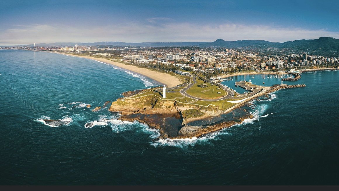
I grew up in the Wollongong Region. Wollongong is the indigenous name that translates to, “between the mountains and the Sea”. Navigation was simplified with the hills to the west and the beach in the east. This image of Wollongong Harbour is credited to Rise Photography.

In collecting visual ideas for my composition using a suggestion of Tom Thomson’s jack pine in the composition seemed like a natural fit. Reversing the jack pine mimicked the topsy turvy nature of moving hemispheres and living “ upside down” or back to front .

The prairie was a surprise to me when I first experienced it but it definitely grows on you and it gradually shares its seasonal expanses. What might look and feel lifeless and extraordinarily flat at first sight is subtle as it draws us in to share in its inspirational personality that unfurls in seasonal chapters. In the early days I found it a challenge to get my bearings in this very flat landscape where roads and sky reached for days and the visual cues within it changed with the seasons.

 I remember thinking of Chicken Little and the sky falling. Those skies were large and expansive. Without the mountains I grew up with on the coast, between the mountains and the sea, what could possibly be holding that broad sky up? Directions were a much simpler proposition when the beach was east and the mountains were clearly visible to the west. 

My very first visit to lake country in Canada was to Shoal Lake in Lake of the Woods at the western edge of Ontario not far from the Manitoba border and very close to the centre of Canada.

 This felt like the quintessential Canadian landscape I had daydreamed of in that long ago classroom. Moonlight reflected beautifully here on deep cold water as we sipped gin and tonics in the screen porch and listened to loons calling to each other in the dark. Our dinners spent under an inky night sky filled with stars and the glowing northern lights with friends are still memorable. 

 This part of the country etched itself firmly into my memory and I painted this nighttime lake magic in the background of “An ode to Tom”. I balanced the flow of ocean and earth by describing their merger as waves of golden wheat in the foreground since wheat is an annual crop that grows on the flatlands of both continents.

I got to know Tom a little better in the process as I took a closer look at his brief body of work, a lot of it painted in the elements on summer painting excursions as sketchy, expressive references to a landscape at the heart of the national psyche.

Paper was my choice of media for those early paintings which buckled and warped with my inattention to preparations for wet media. Resourceful as ever I ended up developing a complex system to flatten the finished pages. My friend and picture framer, whose work elevated mine, was very helpful but it quickly became clear that I wasn’t going to be framing every piece I created on paper. Who can afford to? It wasn’t long before canvas became the less fragile, more substantial ground and the logical next step in my painting practice.

Shoal lake on the western edge of the Canadian Shield was much further west than the landscape Tom Thomson explored on painting trips around Georgian Bay and Northern Ontario's lake country, but both areas shared geological similarities. The lake has many stories to share but we’ll save some for another day. You’ll find I love the lake and it has been the focus of a lot of art and experience over my 20 plus years engaged in studio practice.


“ODE TO TOM”, Acrylic, Chalk Pastel, Eucalyptus Leaves on Watercolour paper, 22 1/2” x 30”, 2002. Apologies for the poor quality of this image. The painting lives behind glass and I was reluctant to tamper with my framer’s fine craftsmanship. Reflections are due to poor lighting and my poor photographic skills.

Imagine the colours to be much clearer and without reflections to interrupt the surface. there you go, you get the idea. :)

I was doing some Re training when I painted these early works on paper, resisting blending colour down to earthy neutrals as had been my early habit. The choice of chalk pastels forced me to use one colour at a time like the printmaker I had been in art school when even then I couldn’t decide on one course of action and had double majored in both painting and printmaking. 

 Duality was a thing even then but I wasn’t fully aware the concept would become such a feature in my life going forward. 

I bought pastels in kits, in batches in fact in any brand I could find as I explored what felt right. Some went on like butter while others flaked off unexpectedly and the occasional one had a gravelly bit that caught the paper like a finger nail on a chalk board that sent my teeth into that awful and undeniable skunk face, you know like biting into tinfoil with a filling.

 The marks I see in “Ode to Tom” in hindsight show the markings as varied as the pastels that made them. There are hints of haste and lines made quickly. Was I trying to do a few more things before I had to leave to pick up kids from pre school or was I imagining Tom Thomson painting plain air roughing in the structure of his subject in loose red unstructured shapes to begin before the weather turned? We both allowed and encouraged these residual marks to speak up on the surface and I always enjoy the visual zing they provide that encourages the eyes movement through a composition. 

“Ode to Tom”, like most of my work shared lessons with me too. It taught me to enjoy materials, to know that there was more available if I needed some so go ahead and dive in and feel free to play. I discovered there is no wrong answer when we talk about creativity that my voice though accented is equally valid.

 I also learned that when your free and expressive nature gets so involved in the making that you inadvertently tear the deckled edge of the paper, to be resourceful and repair it, it is not the end of the world. Life is precious, full of bumps and bruises and wear and tear, but we learn through doing and when we find ourselves going off course we can just redirect and carry on.

As I moved across continents I brought with me a collection of gum leaves and a few of these beauties were literally embedded into the paper surface with gesso. Together they frame the action and act as a counter balance to the Jack Pine image. Those gum leaves are a literal piece of Australiana I have rescued from the yards of friends and family to join in on my lifetime odyssey. 

I don’t know if it is because I am an artist that I immerse myself in landscape in thought and action every day? Or if it is just who I am? I remember walking in Manhattan with my daughter who was freshly graduated from environmental design in architecture. The trip was a grad gift and a chance to take in the sights together. We were both bedraggling as my family would say, stopping to pause and check out ancient details in this densely populated urban environment that 1000’s of people pass each day and would probably not notice. “Mum”, she said, as she realized we were both distracted by details, “we see things differently don’t we”. So maybe it’s hereditary and there is no need for a Question or statement to justify why I see the world the way I do, it just is what it is.

 I wonder how you experience landscape.  What do you see and perceive in your world? 

In our reflection today we explore an imaginary experience of landscape together. Find the recording at 10.55 in the podcast recording. Season 1 Episode 5 “Ode to Tom”

I hope you will join me for a restorative moment inspired by memories of connection: to place, and to the wisdom of our younger selves.

Apple URL for the Podcast - https://podcasts.apple.com/us/podcast/widsom-at-the-crossroads/id1609992256

Apple Trailer - https://podcasts.apple.com/us/podcast/wisdom-at-the-crossroads-trailer/id1609992256?i=1000551067035

Spotify - https://open.spotify.com/show/5AbmRHQor17IeJJivYaYJf


PODCAST. Season 1 Episode 4 "PAINTED LADIES".

Everything takes time and sometimes inspiration waits longer than we intend

Painted Ladies were inspired by this celebratory bouquet

I should maybe have called the painting “Patient Ladies”

Welcome to WISDOM at the CROSSROADS, The PODCAST Season 1, Episode 3, “PAINTED LADIES”, 2019.

The desire for me as a Painter and a Textile artist, to do things a little differently began when I moved out of Winnipeg’s Historic Exchange District after 20 years in the same studio building. I occupied 3 different spaces at 318 McDermot, the last of which was Studio 311. It was here in this space the “Painted Ladies evolved after very patiently waiting for me to catch up with the backlog of inspiration I had collected. By the time I got around to painting them in acrylic, the inspiration had devolved into a bundle of brittle twigs. That’s where creative licence came into play.

Before we get into the podcast notes, …As I was prepping to begin this episode I was juggling the endings of a couple of large canvases I am working on. I am fighting a deadline and wanting to be painting more but as life would have it I am juggling too many other things to closet myself away from reality for as long as I would like to play at solving the vibrant problems I have waiting for me on the wall. I have mentioned I often have multiple pieces on the go and this is because a painting, like preparations for a good meal, can sometimes need some marinating.  Often I will hang an almost finished piece, if space allows, on a wall in the studio so I can see the work indirectly in the comings and goings of my routine.

Today I arrived with a clear intention I had planned for the foreground.

 My current project is quite far along in the process. At this point in a painting each mark has a larger impact on the composition so I try to tread carefully to avoid my over painting tendencies. Today I didn’t have as much time as I had hoped for but the time I did have was engaging and inspiring and ended with a signature which to me is kind of like an exclamation mark that states. Yes. This baby is finished. 

I paused yet still painted and walked away content. It was a good d at the office.

“Painted Ladies, 30” x 30”, Acrylic on Canvas, 2019

“Painted Ladies” is a Still Life: a loose and sketchy suggestion of a once beautiful bouquet that graced the then newly re opened Adelaide McDermott Gallery in Winnipeg. The gallery was on the main floor of the building I rented studio space in from 2001-2019 in Winnipeg’s Historic Exchange District. The Exchange was the centre of Canada’s Grain industry in the late 19th and early 20th,  centuries that became a national historic site in 1997. For those unfamiliar with the city, The Exchange District was the original financial and business hub of the downtown, home to warehouses built at the turn of the century that accommodated the exponential growth of a city known then as the gateway to the west and the Chicago of the north. It harbors a unique collection of early modern warehouse architecture, hip tech start-ups, art galleries, restaurants and more recently, loft style apartments. The area is regularly used as a period movie set. 

In fact, Brad Pitt and Casey Affleck were my neighbours during the filming of “The Assassination of Jesse James by The Coward Robert Ford”, which debuted at the Venice film festival way back in 2007. The funeral scene among others I remember being filmed around and alongside the studio building. I watched the action unfold with other tenants from the roof as all the street side windows along McDermot had been blacked out for the shoot. It was inspiring to see the bustling vibe of the area morph over a few short weeks into a time stamped set where all electrical references to the 20th century were removed overnight just before our streets, the set, closed down for public use and the paved sidewalks became a sawdust covered boardwalk in the old west for filming to begin. 

The whole neighbourhood was involved. The building kitty corner to ours was extra central and at the sound of horn, from my window on Adelaide, I could see whole communities of period dressed actors spill out onto the pavement for their scene. Brad Pitt’s trailer was set up in our loading dock and the stables for all the livestock took over our parking lot across the street, so, yes, I can legitimately say, “Brad Pitt has parked his horse on my space. Movie making in the city might be a theme for another episode, for now I want to get back to those “Painted Ladies” who also had their beginnings in the Exchange district, the subject though, reaches much further south than Chicago.

 After the official opening of the gallery the beautiful flower arrangement purchased for the occasion which featured some Australians: eucalyptus and a central clutch of King Proteas, made their way to my studio for inspiration.  As an expat Australian I have a habit of rescuing Australiana when I come across it. In fact I have a stellar collection of linen tea towels from the goodwill store on Princess, which were a once upon a souvenir featuring all kinds of Australian flora and fauna. My intention with the flowers was first to rescue them so I could paint the arrangement but of course I had so many balls in the air as I usually do that I didn’t get to it until the bloom was well and truly off the rose.

 I did enjoy the view of the shapes though as they dried into a brittle silhouette against my windows light. Someone without an emotional attachment to the subject might have discounted the flowers as a bunch of dead sticks and looked elsewhere for inspiration. Eventually I took out a 30” x 30” canvas and loosely sketched the forms in paint. I’m a Painter. I like to paint and even when I draw I like to sketch in loose liquid paint with a flexible long flippy brush. ”Drawing”, for me even if it is done in paint offers a change of pace from the rhythm of my favoured square bristled brushes. I think most artists have specific tools they are drawn to and those choices become part of the distinctive painterly signature each individual has.


The “PAINTED LADIES” are 30” x 30” acrylic on canvas. A still life that reminded me that inspiration can wait but the creative process is not something that can be put off indefinitely.

The stars of the dormant bouquet were what I grew up calling king proteas because the same Native flowers had grown vigorously in a sandy oasis of a garden bed ,alongside the extended driveway in front of the garage at my childhood home. It was a hot spot and these shrubs loved the heat. The flowers bloomed vigorously alongside the driveway where they were witness to the frequent handball tournaments between the neighbourhood kids and the competitive nature of my pseudo brothers keeping score. This still life is representative of a time and place and I kept it because it resonates as a connection to both my Canadian home and my Australian beginnings, breaching a gap between my past and the present. She was also one of the last pieces I painted in my old studio before I finally moved out of the Exchange after almost 20 years in the same building. These painted ladies became my souvenir.

 The painting is a new addition to my home’s collection. This is partly a space issue as our walls are pretty saturated. Maybe it was a combination of timing and subject that brought her home. I had thought about entering the piece into a competition so she hung on the walls of my last hoorah at the old space but despite inquiries I did not offer her for sale.

 If you are an artist you can probably understand getting into a groove with your work, but I think anyone can relate to the idea of getting proficient at something and relaxing into a process. My process evolves through seasonal chapters, meaning each physical break away from the rhythm of the studio generally results in some variation or change in the subsequent work. Sometimes nuances I only see in hindsight, and I have to admit, this process of storytelling through my archive is really bringing some elements and tendencies into focus. (Thank you Dona and Cindy for your insight)

 For many years my studio life slotted in around the school year and the hectic sporting schedules of our girls. In fact I might still be conditioned to keep that structure as I find I am wearing out energetically at about 10 to 3 in the afternoon which is when I would have packed up for afternoon pickups. Coming back to the studio after a break or a holiday means it takes a bit of time and effort to return to flow.

 I am often asked how long it took to paint “that” piece.  I could respond with an estimate of 25 years, since everything we do brings us to where we are right now, but generally getting back into the saddle after a period away means the effort in the beginning is greater and the results are tighter,. Tighter for me refers to the work feeling  more constrained and depending on your perspective, everything is subjective right, less successful according to my personal painting paradigm.

Once I am in the groove, let’s use the analogy of a marathon runner whose training is prescriptive. When you first start out, there is some pain as your body works out the kinks in your style and technique, by mid-season the muscle memory is more relaxed and the output is too. As a painter that means the work gets progressively looser and freer as I get back on my painting horse and if I have a deadline or am nearing the end of a painting season I get into a flow state and magic can happen. 

 “Painted Ladies” came about during one of those relaxed and comfortable flow periods so the action was quick and fluid and the composition is strong but appears effortless. Muscle memory can account for part of that ease in the final image. Sitting at the dining room table, across from the painting and evaluating her with a critical eye I see her as a blend of presence and memory. There is a distinct structure, the composition in hindsight is showing me a broad square visually (loosely) divided as a peace sign. Colour balances compliments as is my habit but the primary colours are present but variations are more subtle. Yellows are a combination of: lemon, acid green, cream, beige and yellow oxide. Blues feature cobalt blue, emerald green, pale aqua and mint, while the red range is more fuchsia, light pink and quinacridone red light, one of my faves used sparingly carries heavier impact.

 There is balance between the intense rich colours of one quadrant in contrast with the subtle creamy highlights of another. There is movement and action in this still life and a whispy arc drawn in that wet flippy brush in white gesso, washed with mint that simply describes the transparency of the globular glass bowl in which those dried sticks sit.

 I am glad I kept this bouquet which felt a bit like a parting gift as I closed up shop downtown and moved into a new chapter. One of the lessons I learned might be that not everything is for sale and it is perfectly ok to keep personal things personal. I am the queen of overpainting because sometimes I am just so darn attached to the actions of liquid acrylic at the end of my brush that I want to keep going even when a composition is flashing a red stop light that is screaming at me to slow down and come back with fresh eyes. When time becomes a constraint like when a deadline looms for a show or on a rare occasion like this when I was moving, walking away from a piece while it is still loose and fresh naturally comes about as I stop overthinking and get out of my own way. Less can definitely be more. 

“Painted Ladies” became a gift to me. It was a reminder to commemorate both endings and beginnings, to take a pause and to accept where we are, as well as where we have been, before we head off to where we are going.


The colour is more subtle in real life but the gestural essence is the same regardless if the colours are distorted by variations in our computers settings .


Describing glass with a wet flppy brush

Here is the link to go back to the podcast to take in the meditation if you haven’t already. It can be found at 11:11 in the recording of this episode.

Wisdom at the Crossroads, The Podcast is also available wherever you listen to your podcasts. I appreciate you tuning in and joining me as this new journey begins. I will look forward to connecting with you again soon as we journey through the backstories of my artistic practice in the search for presence.

Until then, may you be more, be present and do a little less.

Amanda

Apple URL for the Podcast - https://podcasts.apple.com/us/podcast/widsom-at-the-crossroads/id1609992256

Apple Trailer - https://podcasts.apple.com/us/podcast/wisdom-at-the-crossroads-trailer/id1609992256?i=1000551067035

Spotify - https://open.spotify.com/show/5AbmRHQor17IeJJivYaYJf

SPOTIFY:

https://open.spotify.com/episode/6vfUjwApDxZ5ScqohexDe3?si=cgi3nlaVT3ywCqdBTOLbbg

PODCAST. Season 1 Episode1 "PRAIRIE GIRL"

Cleaning my brushes is a thing for me, wasting paint is not. So this is what happened…

Life is lived in the details. Close up of an area in the sky.

Life is definitely lived in the details. Check out this sky feature in the “Prairie Girl”.

You never know what little piece of magic will turn up in the foreground.

Welcome to WISDOM at the CROSSROADS, The PODCAST! I can hardly believe I am typing that. This project has been a while in the works. The desire to do things a little differently began when I moved out of Winnipeg’s Historic Exchange District after 20 years in the same studio building.

At the time of moving into smaller space closer to home I didn’t really know what that would look like. Add in a pandemic and the loss of two long ago friends well before their time and I kind of felt ,a little bit of “If not now when?” and “Why not me?” So here we are and I am ready to launch myself right out of my comfort zone and into the deep end that is this new podcasting venture.

Thanks for joining me on this podcasting journey. I am looking forward to inviting you into my studio space to share in the backstories of inspiration and process that have resulted in my work in art.

After more than 20 years of studio practice I have created a lot of art. Most pieces find their forever home but over the years I have amassed a collection of artwork that spans my career to date and it is these works that we live with that I would like to begin the storytelling. 

There is a wide variety, there are pieces on paper, on canvas and on panel, and art quilts that have travelled further on exhibition than I have … which is saying something, considering I am an expat Australian and the commute to my original home starts at 12000kms. 

The pieces I have kept are all different yet they do share one common denominator and that is the fact that they have taught me a lesson or modelled something in particular that, I feel, is worth remembering.

Living with them reminds me of a time in my personal or family history and mostly they are pieces I have forbidden my husband from selling off the dining room wall. It was a thing there for a while in the early days.

When we have something in our personal interior landscape for a long time, those pieces can make us feel at home and grounded. It’s only when things change, when we rearrange them, move, or as we are, in recent years during this pandemic, spending more and more time at home that we tend to notice our environment more 

Our personal effects can be a comfort but at the same time the familiarity they offer means they can easily blend into the background to be unremarkable. 

The places and spaces we inhabit and are inspired by can be like that collection of paintings on the walls at home. The more familiar they are the less we see them.

Cathy Heller likes to say, “energy flows where attention goes”. Through our interactions I want to help you to see and experience the familiar, to explore and find inspiration in your personal circumstances wherever that might be to come back home to yourself 

I want our interactions to be about finding and seeking presence and I’ll use the process I am most familiar with to do that


I might be painting on larger surfaces with more confidence in the present but colour remains the focus of my choices in paint. “Blue Gums” in progress.


Creativity has always been my road to presence so that’s where I would like to start. For those not familiar with my work it is generally colourful, semi abstracted and though it might be inspired by a particular place, I have no desire to replicate the real world. I prefer inference and reference and an emotional connection to an experience. 

The act of painting takes me to the zone, that place where time stands still and the worries of my world fall away. It is a place where I am fully present in the moment and a place I would like to introduce you to , to share in the stories my paintings tell. 

The painting I want to chat about in this episode  started out inspired by a collection of photographs I took one day on the trip home from the girls’ gym class when the sun was shining on the incidental green space along the side of the road. It was wild and woolly and fully in bloom. This painting has taught me several lessons including a new reminder I am in need of learning and that is ..to keep better records of my work 

I am embarrassed to tell you that I don’t have a professional photograph of this piece, nor a name written on the back of the stretcher, which has been my habit for many years now. 

I am going to rename her “Prairie girl” after the once small prairie girls whose daily activities inspired her beginnings. At home she hangs in what we affectionately have come to refer to as the Starbucks corner. 

I don’t know about you but at our house during covid we have found different uses for the different areas in our house. The dining room has become a multipurpose design studio, a zoom room, an office and a bistro for when the take out boxes are traded for a tablecloth and dimmable lighting. 

The living room is my daughters’ office, preferred by the cat in the afternoon and also the yoga barre. But since I am inviting you into my space and suggesting you get yourself a cup of tea or coffee, something stronger if you prefer,… there is no judgement here.  Let’s imagine we are settling into the Starbucks corner in the lovely morning sun


“PRAIRIE GIRL”, with her eagle taking flight in the background and her fairy magic occupying the foreground.

The painting, newly renamed “Prairie Girl”, is a semi abstracted landscape, 30” square, painted in acrylic on canvas in 2001! That was in the very early days of having a studio when I shared space and barely had time to get there during the course of any week. 

Those were the days when the needs of our then very young children were my focus and my creative practice slotted in anywhere I could squeeze it in. The rhythm of the weekly schedule showed me snippets of inspiration but I did not have the luxury to take a day or an afternoon to seek and be inspired so I took any opportunity as it arose. These moments had to be found as they could so easily have blended into the background of familiarity.

In 2001 our daughters were 6 and 4 year olds and gymnastics was a weekly activity. The facility we attended was a bit of a hike from home, along a secondary road yet still within the city limits.

 I don’t want to say I am a distracted driver, but I am very observant, I am curious and I am always very aware of my environment. 

Each week the roadside foliage along the way, some might say weeds, but that’s a judgement and remember, there is no room for  judgement here… with each passing week the foliage scrambled more and more energetically as the weather warmed into summer and the roadside bloomed. 

I love a little incidental landscape, you know, those un curated spaces along the side of the road, in infill lots, along railway lines, in suburbia, or anywhere really where the weeds and grasses are allowed to compete and freely blossom. 

In the image “Prairie girl”, you can see the suggestion of the prairie landscape stepping into the background and the roadside weeds scrambling in the foreground. 

For me this painting will always be a direct reference to that one sunny day after gymnastics class when I pulled off to the gravel shoulder in my bottle green minivan. I handed my girls a snack and juice box to consume in the backseat while I quickly snapped a dozen or so pics on my elf camera before hopping back into the van and heading home.

 I am dating myself but this was before digital cameras and iphones, nothing was instantaneous and printing the film was a delayed and intentional act. My studio at that time was a shared squeeze but was a space that was exclusively mine while I was there in the odd hours I could make it and it was a place to be creative.

 There, I was not worried someone would eat the chalk pastels or hurt themselves with toxic or sharp implements and I could relax and immerse myself in colour, in the process of interpreting the world around me.

I worked on paper initially and quickly developed the habit of painting on multiple projects simultaneously. I can’t even remember what I was working on as the main focus at the time but I do recall I had this 30” x 30” canvas that kind of became the canvas I ended my day with. ( meaning I used it to clean my brushes and use up any excess paint at the end of my time there. 

The foreground evolved into a reference to that overzealous stretch of wildflowers on the roadside. It is quite colourful as marks were dependant on what had survived the day in my paint pallet. It’s a little repetitive and just like the weedy blooms I was recalling, it too found its own rhythm 

This happened without much conscious thought and the piece evolving from a vague premise without any preliminary thoughts or sketches. My primary goal was to use up the paint and not be late for pick up.  I was immersed in the process with zero expectation and I guess effectively I was getting out of my own way. This incidental green space first encountered in those trips to gymnastic class, had bloomed through the struggle and competition for resources untended just as my painting had began. 

This “Prairie Girl” reminds me to be present, to be observant and to be aware but possibly the most important lesson I learned happened in the top part of the composition, in the sky. When I did take a pause to evaluate what was happening in the canvas I didn’t feel the sky was  working so with one of those critical self-statements I remember telling myself emphatically.. “Mand, this looks like absolute crap!” So I proceeded to paint out the sky with white gesso , effectively overpainting with the intention to erase what I had done and start again. 

As luck would have it the paint oozed in great globs across the surface as well as my desk and since it was almost time to leave I gathered a spoon or something to coral the liquid mess back into a container.

 As I brushed and dabbed at it some of the purple paint from below the surface began to blend with the white and as each spoonful of salvaged paint stretched across the painting to reach its salvaged container, long strings of liquid paint drizzled across the surface

Exasperated and literally up to my elbows in wet paint I paused to take in the sky that had bloomed into a pending prairie storm. And if you look closely there is the suggestion of a giant eagle taking flight. “Prairie Girl” lives in the Starbucks corner of our living room. She has a beautiful handcrafted bloodwood frame crafted by my talented friend and picture framer. In it her presence reminds me of my own “Prairie girl” It reminds me to take those detour adventures when i can and to allow events to unfold. Sometimes what happens will follow the course we have planned while at other times a new path will be forged and that path just might take us to somewhere new and unexpected.

Years later while I was doing some experiments with dye sublimating imagery onto fabric I used this same painting as a source image. It meant really enlarging parts of the composition. When I received the prints back, details from the foreground had blossomed into a clear elemental image, a lovely fairy hidden in plain sight. She became yet another reminder to be present, to be aware and observant in our daily travels because we just might find some hidden magic along the way.

Here is the link to go back to the podcast to take in the meditation if you haven’t already. Wisdom at the Crossroads, The Podcast is also available wherever you listen to your podcasts. Thanks for tuning in and joining me as this new journey begins. I will look forward to connecting with you again soon as we journey through the backstories of my artistic practice in the search for presence.

Until then, may you be more, be present and do a little less.

Amanda

Apple URL for the Podcast - https://podcasts.apple.com/us/podcast/widsom-at-the-crossroads/id1609992256

Apple Trailer - https://podcasts.apple.com/us/podcast/wisdom-at-the-crossroads-trailer/id1609992256?i=1000551067035

Spotify - https://open.spotify.com/show/5AbmRHQor17IeJJivYaYJf

SPOTIFY:

https://open.spotify.com/episode/6vfUjwApDxZ5ScqohexDe3?si=cgi3nlaVT3ywCqdBTOLbbg

The Painting 101 Series, 2019
From left to right: #39 “Birch Church”, #48 “Dancers”, #63 “Flaxen”, #87 “Hustle”, and #73 “ Transition.”

From left to right: #39 “Birch Church”, #48 “Dancers”, #63 “Flaxen”, #87 “Hustle”, and #73 “ Transition.”

Adelaide McDermot Gallery reopened in the spring in downtown Winnipeg. It is a lovely refreshed space on the ground floor of the building that has housed my studio(s) since 2001. I am very glad to be exhibiting here at 318 McDermot Avenue in the Exchange District over the First Friday weekend in December.


•Friday, December 6th, 5-9pm

Continuing through the weekend:
•Saturday, December 7th, 12-5pm
•Sunday, December 8th, 12-5pm


BACK TO WORK AT PLAY

September is a time of new beginnings. It is when Canadian schools return to programming after the luxury of our extended prairie summers. September is about new class schedules, renewed focus and a return to routine.

Working as an artist is like working in any job. Getting back to work after a break requires some motivation and a little easing in before we get back to optimum productivity.


My studio is a sanctuary and I am always happy to go back to work there, in fact I will be there all weekend if given the opportunity. There is no shortage of inspiration yet, sometimes the challenge lies in how best to apply that inspiration.

The fall season this year was no different. As my family resumed new schedules at work and school I too needed to refocus. The Painting 101 Series began as a means to refocus my creativity, to reacquaint with the feel of liquid acrylic on my brush. The project began slowly but soon blossomed into a solid goal after the summer break.


WHY:

Both craving and resisting routine, the goal was to give myself a challenge that helped to reset my creative rhythms for the new season.
I began where I am on the prairie and liked the idea of giving a vertical emphasis to what is traditionally considered a horizontal subject. I divided full sheets of water colour paper into 11” x 6” sections. By painting small I resolved to play without my inner critic and the fun began.


HOW:

When painting on larger canvas I hang panels in groups on my wall and work standing. Smalls did not fit that format so along with physical adjustments and a reorganized space, the process forced me to reevaluate how I use designated areas within my studio space. It was an additional challenge for a creature of habit like myself.

The discipline of this studio project helped to reestablish my creative process and soothed the loss I felt with summer routines now in the rear view mirror.


WHAT:

Liquid acrylic paint on my brush and the challenge of composition energized me enough to cut more paper and set myself the official Painting 101 Series challenge.

A self imposed deadline can be useful for the sole practitioner. My studio is a lovely oasis, but also a work space. “Boss lady”, my studio alter ego, did a great job of shielding my studio time from well intentioned distraction, and visitors, and inspired me on both weekdays and weekends to accomplish this goal.


SUBJECT:

Themes developed as I arrived at the studio and dug through my long collected stash of photographic inspiration. Using a visual cue can be a useful starting point, it helps to establish a beginning, a jumping off point from which the composition can bloom.

I use visual stimuli as a suggestion only and allow the process of physically painting to evolve through any composition.

What felt right on any given day varied. The garden, the poppy, the lake, fall colour and summer snapshots all bloomed freely as source material inspired a beginning but did not dictate an outcome.

PROCESS:

There was no plan, no order and not even consistency on any given day beyond the colours waiting on my palette. I wanted to feel the joy of wet acrylic on my brush, to paint loosely, to review the familiar and enjoy my work without expectation.

Completed pieces assembled in loose rows on my floor and on more than one occasion piqued the interest of Sarah Anne Johnson’s fur friends, Kitty and Lola, who stopped in, sniffed them out delicately, and went on their way to their own office next door.

FURTHER PROCESSES:

Water colour paper warped and curled under the loose application of wet media and meant the pieces required flattening in batches under some of the art world’s heavyweights at the studio.

 
image1 (13).jpeg
 

Some pieces even hid in their drying stacks of books and caused me to overshoot my goal.

With a little help from my friends I worked through labelling, photography, ( Rob Barrow), and matting ( Tim of Chicken Coop Productions) This work is now complete and these 101 pieces of original art will be on sale for $101 plus taxes at my upcoming show.

When I published my book, “Wisdom at the Crossroads”, one of my first customers described it as being “weightier than its small stature”. This body of work similarly is small, energetic and colourful but visually they deliver a punch above their weight class. Mounted on archival matt board they are ready for gifting or framing and are perfect for first time collectors.

I am pleased to be exhibiting the entire completed challenge during The Exchange District’s FIRST FRIDAY in DECEMBER weekend 2019, along with some recent works on canvas and the Healing Blanket Project.

With December comes the holiday season, a sacred time of celebration and connection.
While the Painting 101 Series will provide visitors with colourful inspiration, the holiday season can be tough for those experiencing difficult times.


THE HEALING BLANKET:

Imagined as a receptacle for the physical, creative marks of those who ordinarily would not have that opportunity, this community based project is an ongoing initiative that will be available for visitors to work on during my show.

Come join us and add a stitch in time, with, or in honour of, someone you love or have loved.

To date, The Healing Blanket has been the recipient of many encouraging, beautiful, inspiring and sometimes heartbreaking stories.

My hope is for it to remind visitors that no matter what difficult circumstances prevail in their lives, particularly over the holidays, we can be reminded, we are not alone in our struggles.

My family has added stitches in honour of the youngest branch of our family tree, my niece, Edyn Tani, who is our littlest angel.


Edy - The Healing Blanket - Amanda Onchulenko
 

She inspires us still and in her honour a portion of all weekend sales will be assigned to a memorial fund for our angel Edy.

I am grateful for all the connections I have made through my art and look forward to seeing friends old and new over the weekend. We hope you will join us and be inspired by the colour of my world.
Friends and family all welcome.

"Be more. Do less." ATO

Painter's Process
Sometimes a piece begins with some colour blocked areas.

Sometimes a piece begins with some colour blocked areas.

I paint with a printmakers mindset and one colour at a time on my brush.

I paint with a printmakers mindset and one colour at a time on my brush.

I always paint the edges of my canvases so the image does not always require a frame.

I always paint the edges of my canvases so the image does not always require a frame.

I am grateful to be a full time practicing artist, to be able to engage in creative explorations that can very often dissolve time. No day is the same. I have flexibility in my day; I am my own boss, even though my boss can sometimes be a very hard task master.


I believe creativity is as much about routine as it is about talent. Nobody just gets up in the morning and creates a masterpiece. There is preliminary work involved and this work is fueled by passion. I have had a studio since 2001, I am at the studio every weekday and have trained myself to work around the school day. My children are in university now but my body clock still kicks in for a change of focus at ten to three.  


In my work I aim to challenge myself to uncover a little of the unexpected as I strive to resolve any given composition and this is where play comes into my working philosophy. Creating anything is like training for a marathon; the hard yards make the end result look easy. Enjoying the journey as our process evolves is the key. Just as no day is the same, similarly not every studio day produces stellar results and I have to give myself permission to accept my failures as sometimes a mistake can lead me in a new and exciting direction.


As Artists we each have a predisposition to a particular palette, mine favors clear colours; “brilliant blue” by Liquitex and Golden’s “pyrrole red” among them.


 In the beginning however, I was a blender. Everything blended down to shades of burnt umber, raw sienna and red and yellow ochre. With the addition of black and white I created shades and tints. This palette was useful for my earliest photorealistic beginnings. I have learned however, to see colour as a mechanism  to define the same changes in value.


In Art School I double majored in painting and printmaking. For printmaking we learned to think in layers of solid colour. While I loved printmaking, the toxic oil based inks involved in the process did not agree with me so while I discontinued the practice I did salvage some conceptual approaches from the discipline that I use to this day as a painter. To simulate the layering in painting I began to under-paint in acrylics and overdraw in chalk pastel, thus holding one colour at a time in my hand. Together these ideas developed into my present work which is primarily in acrylic. Acrylic is a forgiving medium. It is quick to dry and could always adjust to my need for flexibility regardless of whether I had a few minutes, an hour or a whole day to work.


I am a creature of habit and like many artists I am drawn to particular tools. I like a flat square bristle brush in it various sizes for larger areas and a thin flippy brush for drawing in paint.

 
Any drawing is done in paint with very wet paint and a soft thin floppy brush.

Any drawing is done in paint with very wet paint and a soft thin floppy brush.


Composition is definitely a focus of all of my work. Composition is about relationships, how one area of an artwork relates to another. I like to think of my compositions as “Communities of Colour”, where colours pair up, form groups and compete with, react to and/or assist each other.


The aim of which is to move the viewers eye around the surface from one compositional point of departure to another. 

I employ some basic compositional devices in my practice which I find important but not an exacting science: The golden mean for example is a system of defining proportions that I casually refer to as an estimation or guideline when thinking about a work in its beginning stages, as a piece is developing, and through to its completion. My more recent work has more of an intuitive feel with less formal planning but still these compositional guides come into play as a composition evolves.


For simplicity sake I often employ the rule of thirds where these horizontal and vertical (imaginary) divisions provide the basic structure of an image. These “rules” are used as a reference point during the evolution of an image. 


Energy can sometimes be exaggerated in a painting by tweaking or distorting these guidelines. Being “a little off” can be a good thing.


A diagonal path from one compositional point of departure to another can also help the “energizing” process. 


Working in layers the underpainting stage is the most fun. It is free of intention and so carries no expectation for an intended outcome. This is usually done in complimentary colours. As the composition evolves the residue of marks applied during the layering process can become a powerful tool in moving the viewer’s eye around the surface. 


Sometimes I like the under-painting so much the work never progresses beyond that point. .And of course sometimes it is abandoned to become something else on another day. Turning an abandoned piece on its head on my paint wall has been known to inspire some interesting changes.


My paint wall is equipped with studs that allow me to hang and remove multiple panels easily. Painting a diptych or triptych offers the added challenge of multiple compositions which also adds to the problem solving fun.

That fine, “flippy” brush comes into play to transfer my thoughts to a panel or canvas, my theory being, if I am working in paint, I should work only in paint from the outset. More recently the drawing aspect of my painting practice has come into play as a composition progresses to accentuate or clarify something.


Colour and its relationships will always be a part of my work regardless of media. When equal amounts of colours opposite on the colour wheel, or complimentary colours, are placed together the eye is content. The eye reads the proportions as balanced. When the same colours are used in disproportionate amounts their reaction reads like a vibration as the eye attempts to adapt by visually balancing the two. I like to refer to this as a “Popper”. In my compositions there are some places where the viewer’s eye can rest and others where the eye is pushed around. A “Popper “is definitely a pushy little devise I love to play with. 


The end product is an evolution through layers of process.

The end product is an evolution through layers of process.


The absence of black is another characteristic of my work. I make a dark shade by adding compliments together. I find this version of a dark keeps the work active and vibrant. I also wash my brush frequently to keep my colours clear and prevent them from greying down.
Landscape has informed a lot of choices over the years. I am inspired wherever I am and search out potential subjects without realizing I am actually doing it.


I was known as the drive by shooter for many years by my family as I sat in the passenger seat on our frequent cross country road trips to sporting events with our athletic children. These reference images usually gathered in groups, were used to inspire a starting point for a piece or series. There was never the intention to recreate what I had photographed but to collage the essence of this with the curve of that as a project developed. 


Lately I have abandoned visual notes altogether and trust my painterly instincts to work intuitively. As my practice has grown and evolved my brushwork has gotten looser. I feel like I am off my game when my panels are tight but this is usually reflective of having had a break from routine that requires some more diligent practice to get the creative juices flowing again.


My studio remains my sanctuary and though my artistic practice includes textiles and more and more writing, I will always be a painter at heart, constantly expecting the unexpected, mindful of negative space and always at play at work in my studio.


“Colour quiets me, colour lets me sing. It is my language in all its affectations of nuance, of syntax of pronunciation. My voice is most clear in colour”.