Posts tagged acrylic painting
PODCAST Season 2, Episode 7, "A CELEBRATION OF THE POPPY"

WISDOM AT THE CROSSROADS PODCAST.


SYNOPSIS: A CELEBRATION OF THE POPPY

The backstory of studio practice in this episode celebrates the random yet divine ways colour connects us to ourselves and to each other.

We chat about the subjective process of commissioning art and the fact that a refreshed painting is one that was once finished, then finished again.
With a hint of whimsy and freedom we are reminded how we interpret art depends on our perspective and what we are ready to see.

The meditation this week Is a guided self care pause and definitely one for the books. It celebrates the power of intention and encourages us to act instead of react.

Believe me your airport experience will not be the same with this oasis creating technique in your meditative suitcase.
The meditation in this episode is a little longer at 12 minutes., but you deserve it. It’s a very effective chakra cleanse and one of my favourites. Find it at 10:20 in the recording.

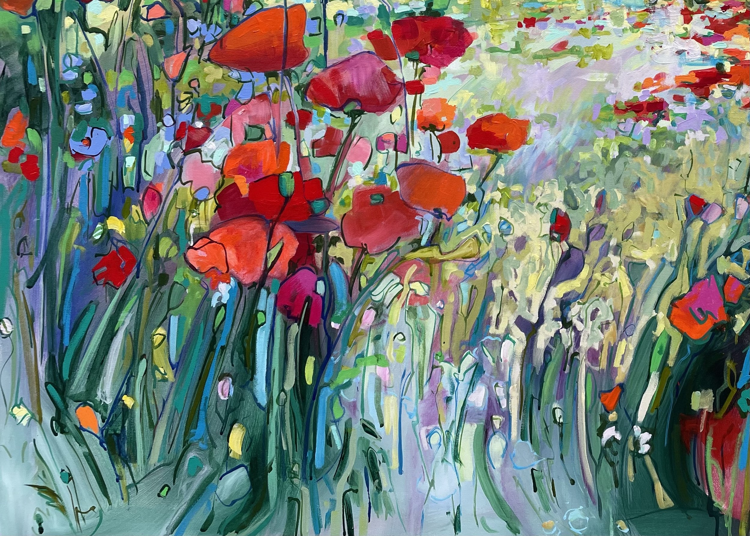
“TINA’S GARDEN; A CELEBRATION'‘, Acrylic on Canvas, 36” x 48”, 2022.

Before I begin today I want to express my gratitude…

 I have always appreciated my clientele. In more than 20 years of studio practice you are the reason I have been able to continue to do what I love to do. You know who you are. Whether you started as a friend who became a client or a client who became a friend I want you to know I appreciate you. I appreciate the connections we have made through colour and I am grateful you are part of my community.

 It really is the people we choose to be part of our lives that make it what it turns out to be. My life is better because of my friends and I am grateful for all of them

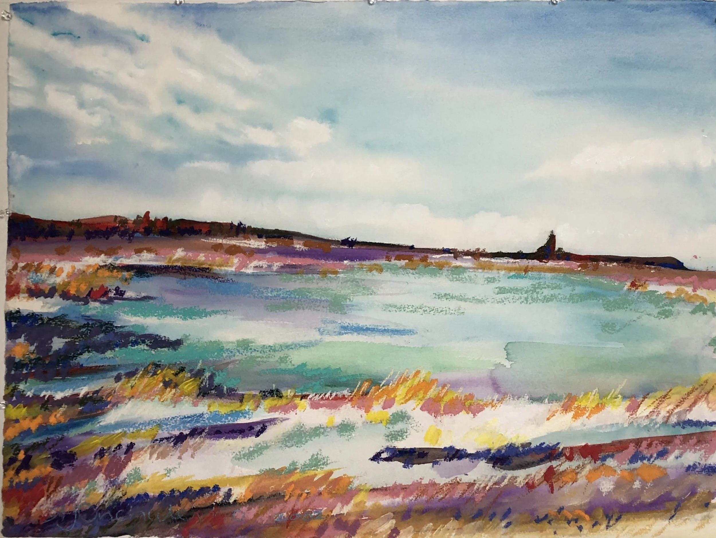
This 36” x 48” canvas began with the word “CONFIDENCE” inscribed with gesso into the raw canvas surface. This snapshot shows the first two layers that got the composition off and running. First I added colour to the surface in loose confident strokes, then began to draw my thoughts in paint with very liquid acrylic paint.

 I had one friend, and client, comment on my work recently after I had asked if she had any questions for this podcast. She has seen many bodies of work develop over the years and had noticed different “bodies of work” featured periods where different colours dominated the paintings. Picasso had a blue period? Maybe I have had blue, and a red and a yellow period?

I appreciated her observation. Sometimes it takes a fresh perspective for us to realise what we don’t know and to bring our own process into focus.

We had also been chatting about the chakras and wondered together if I had subconsciously been doing personal work while at work within my painting practice. Now I don’t know the answer to that question but the patterns were apparent so I definitely have some thoughts to ponder in reflection.

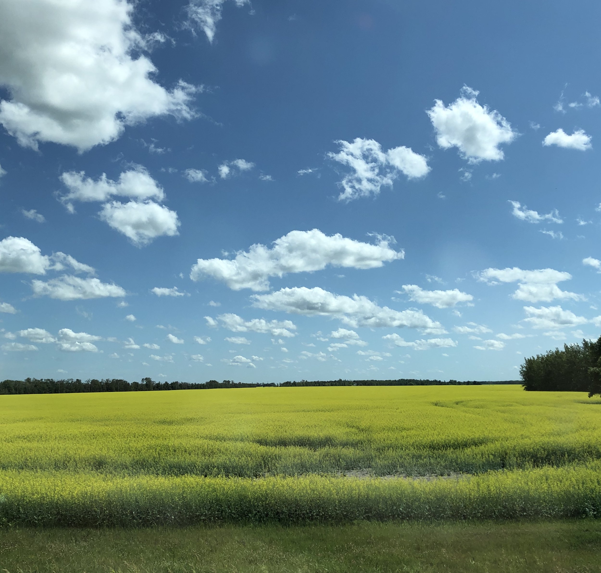
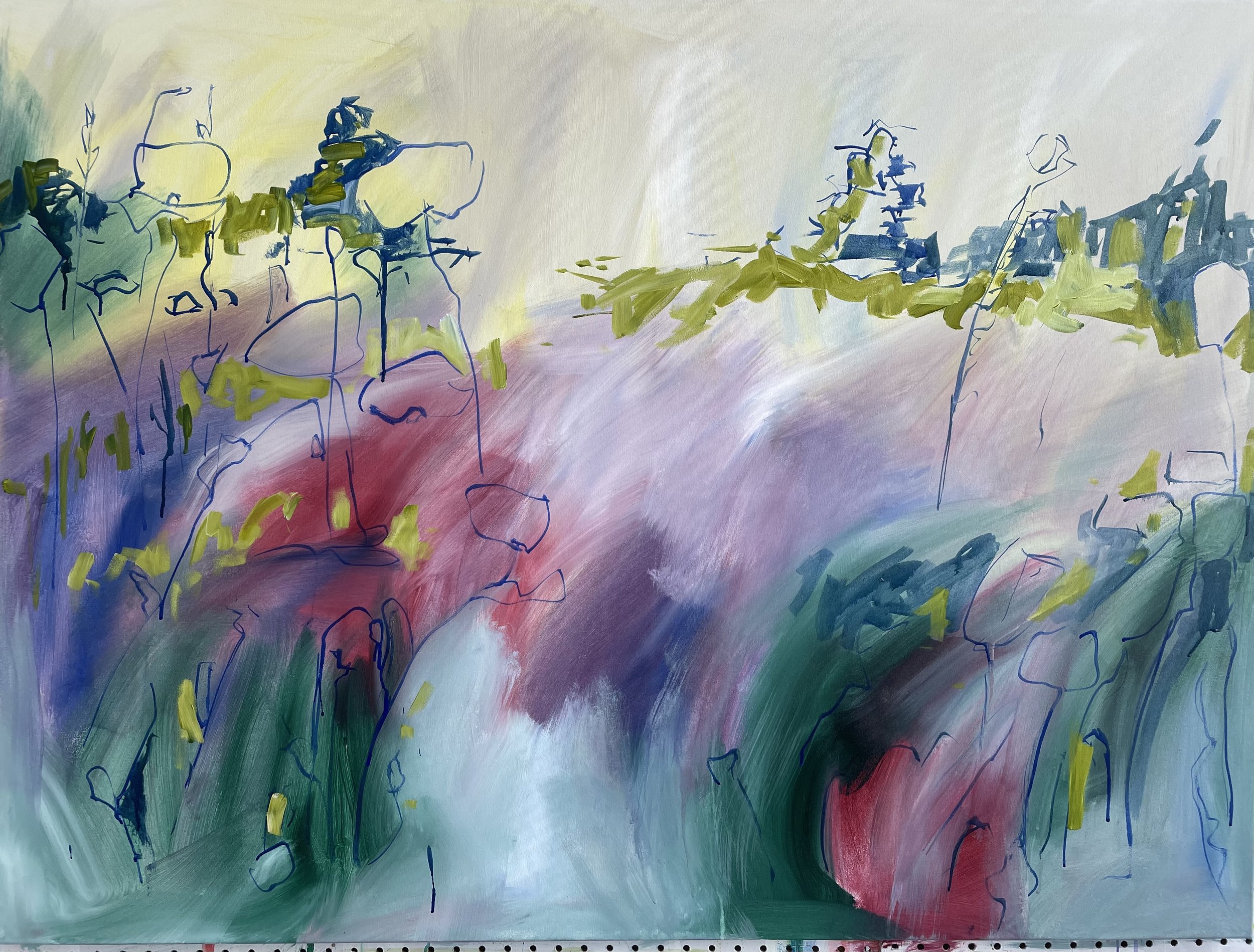
Inspiration is everywhere. Some of it comes from simple walks in the neighbourhood. This pic was part of a group i took walking along Bishop Grandin Greenaway this past summer. This is one of a group of images that will join images for visual reference in the future.

How about you, has a friend ever brought something into focus for you in your world?  I bet you are nodding your head. Thank goodness for our friends hey, I hope your friends are as awesome as mine. My friend’s favourite paintings over the years have often been those featuring Poppies. The poppy has been a recurring subject in my semi abstracted work with landscape. I use them as a vehicle for colour and have found many others have a personal or cultural association to them as well. I guess you could say the poppy as a subject became my bread and butter as a painter. You know, like a ceramic artist who becomes known for their tea pots or bowls or mugs, I am often associated with the poppy and the use of clear and vibrant colour in my work.

Poppies are definitely inspiring and I am sure their cheeky personalities will continue to inspire me.

Pausing to reflect on where this or any painting is going is a process. Changing the scale, or altering the perspective are strategies i use to see where the painting is in the process and where i might take it, or it me.

 I love for instance, the way the poppy’s delicate paper flower forms react to the wind and choreograph new visual pathways with every breath or gust. I’m inspired by their strength and fortitude knowing they survive such a diverse range of conditions, in such a variety of landscapes and yet still manage to thrive year after year. There is probably a lesson for us all in their example.

 I also have an attachment to particular shades of red. I love for instance, a good shoe tanned to a warm oxblood. I also appreciate the resonance of quinachridone red light which I use in the underlayers of a lot of my work, and, though painting with colour quiets my soul, I am strangely attracted to the screaming nature of particular shades of red. Pyrole red for example which now comes in three “golden” variations is one of my favourites that becomes like an exclamation mark in the visual vocabulary I use in paintiong.

Those lovely reds seek attention like noise in an airport where the din of regular announcements, gate calls, and music compete with rolling hand luggage clattering along pathways in commuting herds.

This snapshot was included as context. Indoors at my studio the paint wall was blooming with colourful works in acrylic. The subject was hypothetical as this was more the end of winter vibe that was taking place beyond my studio window.

I was in an airport as I thought about this episode so the meditation that follows a little later evolved into an effort to find an oasis of calm in the crush of commuter activity. The process developed intentionally while it also addressed a personal need I had at the time to shut out some of the major airport stress we are getting reacquainted with as the world reopens. So maybe my friend was correct in her hypothesis that the elements of a painting become the parts of my accented language that like water finding its level, is the healing journey I travel?

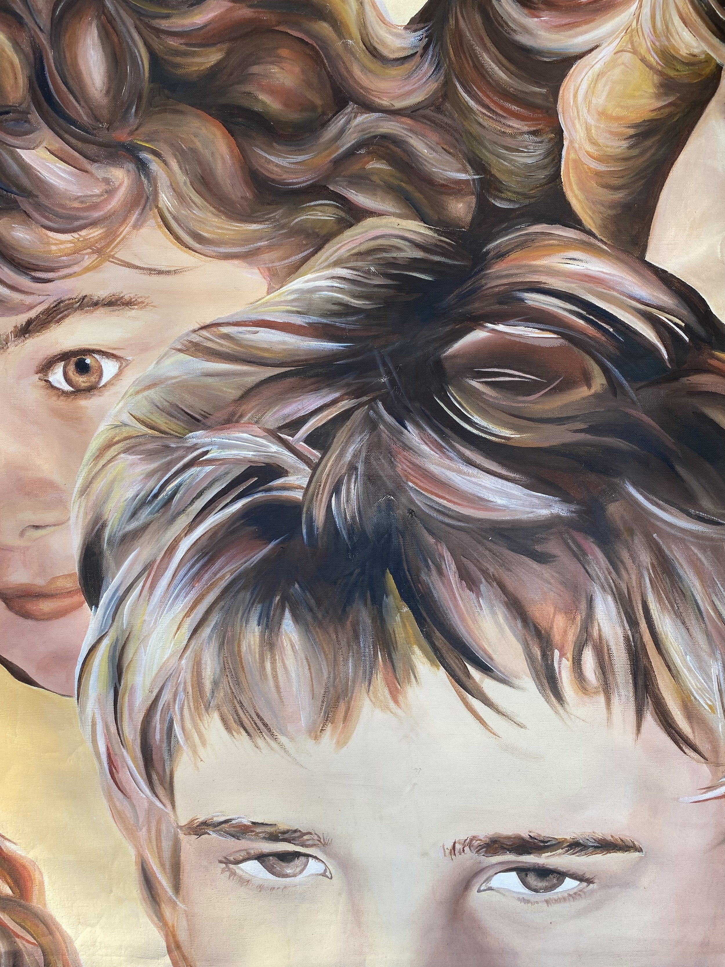
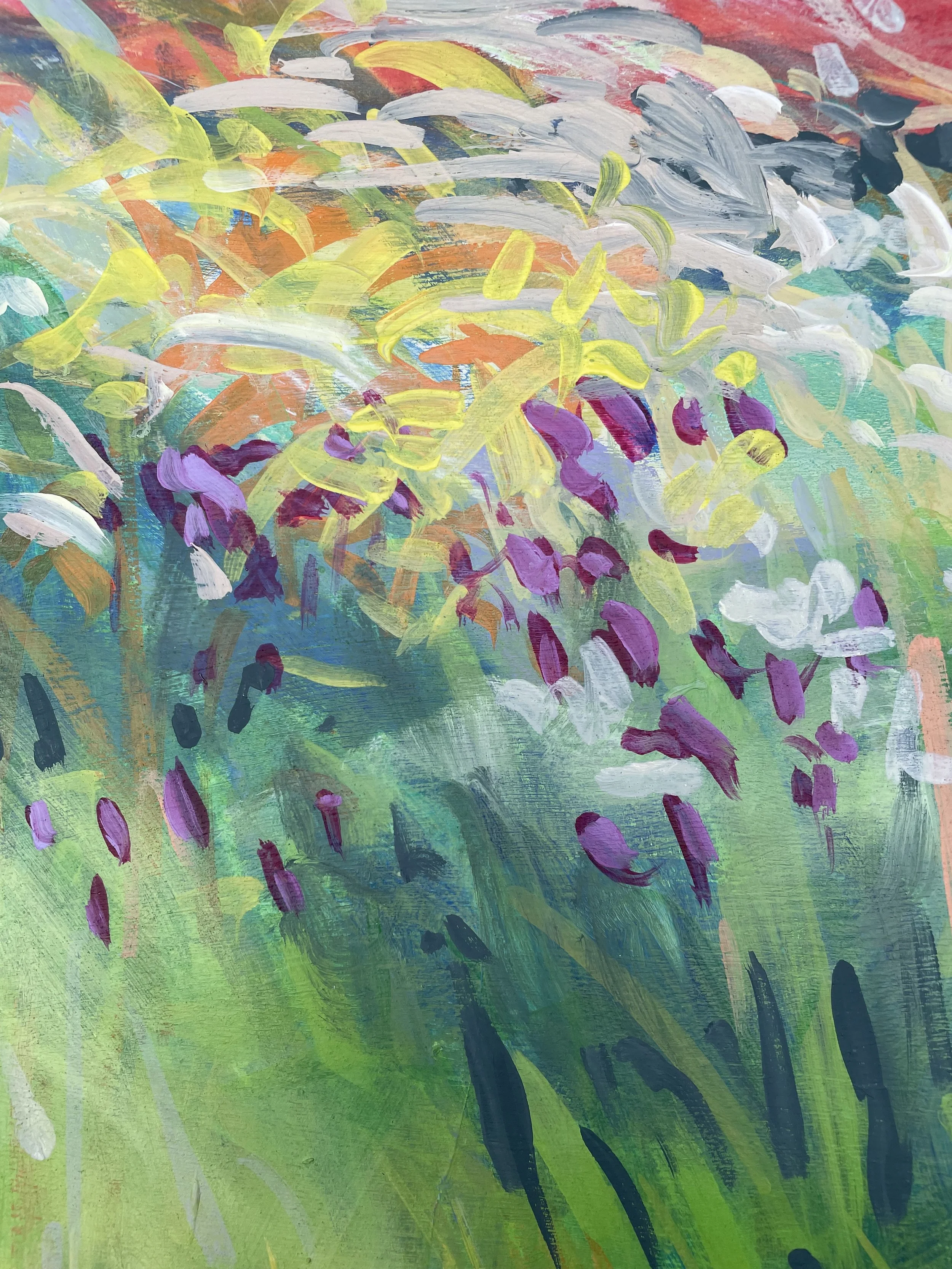
I loved the sketchy nature if this solo poppy that bloomed in the background.of “:Tina’s Garden Celebration”

Staying with the poppy theme this episode I thought I’d share a little backstory about a recent painting with the poppy as subject. Earlier this year I was approached by a couple who were familiar with my work and had decided they wanted to commission a painting for their home. We auditioned sizes and configurations and they decided on a 36” x 48” horizontal canvas. As per my usual process I primed 2 canvases of the same size and got to work on the first.

A commission can be a challenge as I strive to be true to where I am in my personal process while also being cognizant of my client’s requests. None of us can read the visual cues that occur inside the mind’s eye of another, however hard we try, though wouldn’t life be a curious game if we could……

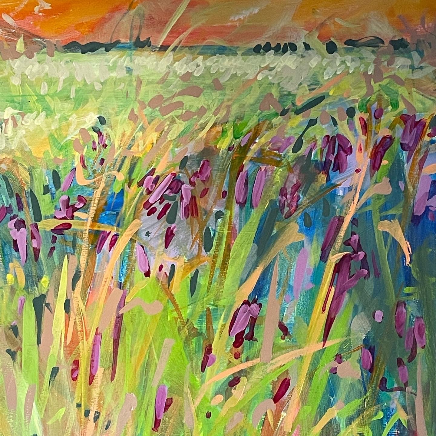
Celebrating life in the details. The texture of canvas came into play in this part of the composition.

As a painting progresses I can sometimes feel i have less and less control. paintings can have drive their own direction.

Because painting is so subjective I suggest that those looking to purchase art do so for themselves only. Please don’t ever buy art for somebody else and never make a purchase because you feel the artist has gone to all this trouble on your account. Believe me when I say nobody wants their work to be relegated to a back room or closet because you felt obligated to make a purchase or gifted art to someone else because you loved it and hoped they would to. Believe me it doesn’t often work like that.

The process of commissioning art.

 When discussing a potential piece and giving instructions for the parameters of a commission there are some who trust in my process and experience and leave me with a “go have some fun, we love what you do” approach. And. there are others who offer more explicit instructions that can occasionally be extensive.

I love the details . sometimes its hard to describe why a mark like the pink stripe in what reads as part of the petal here inspires me. It just does and i work around it to keep it in the composition.

 I love the challenge of painting whatever the subject so whatever end of the spectrum my clients fall into I try to be clear.  I will definitely have fun and enjoy the challenge but I will not offer any guarantees that my vision will match there’s and for that same reason I also insist there are no obligations on either side of the equation.  If after 2 shots I can’t create what you envision then now is just not the right time for us to work together.

Often the problem at the end of the process becomes a complicated choice of which painting to buy? Do they choose the piece that more closely addresses their original criteria, the first version or do they choose  the second composition I painted with less of an attachment to an outcome? On more than 1 occasion my clients have gone home with both.

In this case my clients loved  both pieces for different reasons and after much deliberation adopted the second version. A hint of whimsy and freedom had been the deciding factor that connected this couple to the painting and to a significant event in their lives.

I love the way the universe works and how our individual perceptions connect and converge in such seemingly random yet divine ways.

Detail of “Tina’s Garden Celebration”.

As a composition gets closer to being finished each mark has a larger impact on the surface. Nothing happens in isolation.

Painting 1 has a lovely new home while painting 2 moved temporarily on to the side wall at the studio. My new studio you might recall me saying is tiny so I had a lot of opportunities to see this piece in my peripheral vision as I worked on another series on the paint wall. Eventually I gave in to the “there’s just one more thing” that led to a few more things before I photographed the painting again and added a “refreshed” to the title. The word “Refreshed” is my code for this was once finished then I finished it again.  How to decide when a painting is finished might be a story for another day? We’ll have to wait and see. The week this episode aired coincidentally was the week “Celebration: Refreshed” also moved in with her new family.

This is the other half of this commissioned equation. I made a revision, which means after it was finished, i finished it again.

 Looking through my archive to realised I had created an earlier painting that was full of action and felt like a “celebration”. So the addition of the refreshed is definitely necessary. I can be guilty of overpainting even though I am often striving for simplicity. The best laid plans are sometimes just a plan and we have to accept their evolution through process.  In life as in art some things build in louder and louder layers, much like the sound scape I found in that airport. Other paintings might offer a visual pause or a personal respite, It just depends on our perspective and what we are ready to see.

Looking through my archive I realized I had previously named this busy painting “Celebration”. It has since been made into one of my MANDART pillow designs. These are available seasonally at pop up events or own request.

The colour red is traditionally associated with the poppy though not all poppies are red. The colour red is also associates with our Root Chakra, the energy centre that exists at the base of the spine. The root chakra connects us to the earth, to our physical bodies and helps to ground us in the present. I do have a tendency to be a deep thinker so maybe I have been using colour and red in particular to connect me to the earth, to ground myself in my physical world or to satisfy a need within myself?  Anything is possible right?

“Why is your backpack so heavy?” my husband asks when i occasionally pass him “Bertha” when we travel. On a recent trip i developed the meditation that you’ll find in todays episode. This is the cherry quartz heart i happened to have with me on my journey.

Cherry Quartz can help us to feel energized, to reestablish our equilibrium, encourage, vigour, and enthusiasm …perfect to have in an airport :)

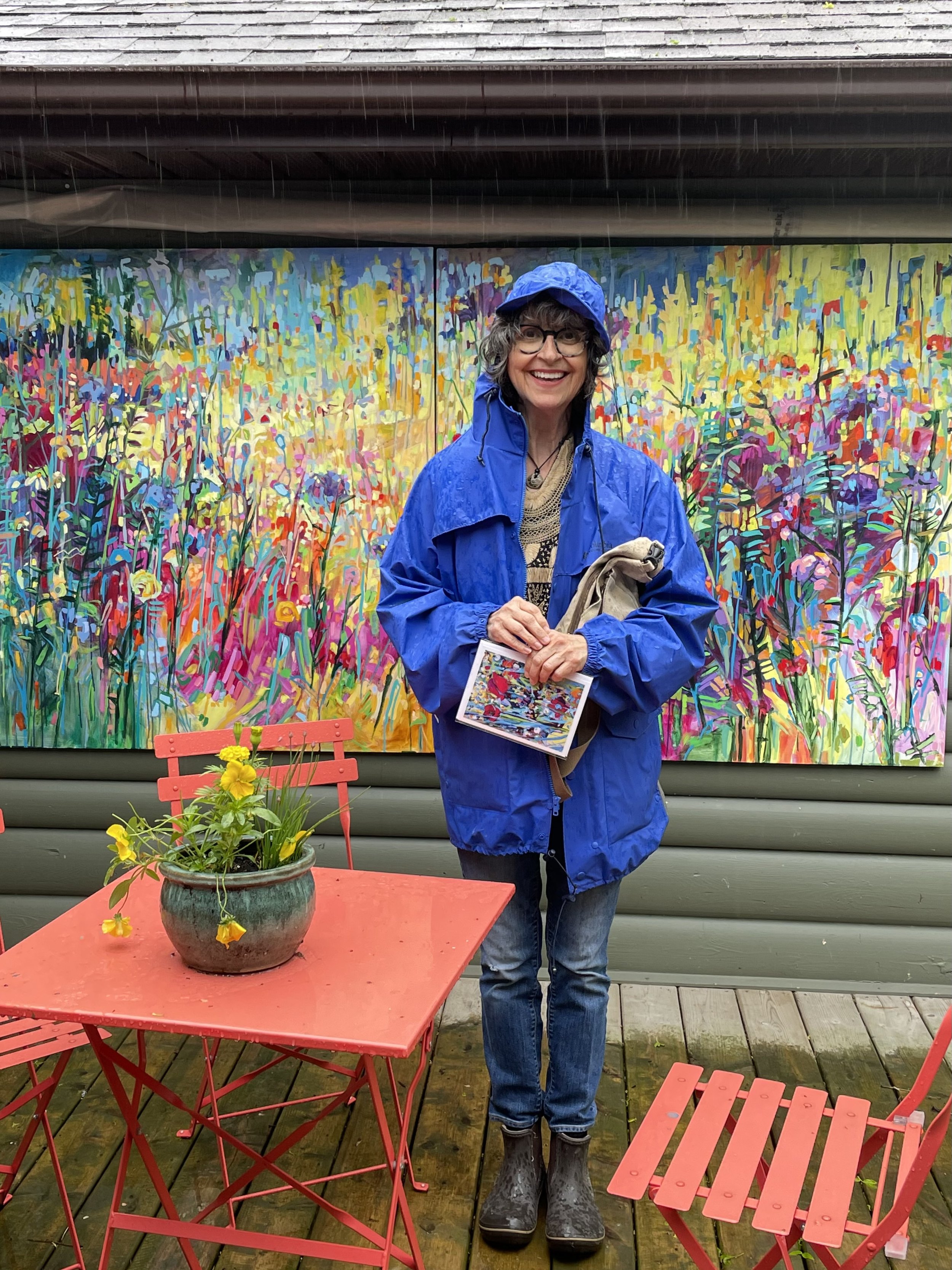
It seems we have reached the end of todays backstory. Thanks for tuning in to this episode. I really appreciate you spending some of your valuable time with me. I hope the images are helpful and that you are finding something of your story within mine by listening in to the podcast, or catching up through this blog.

The meditation this episode is 12.minutes but I guarantee you will feel refreshed after taking a self care pause with me. It begins at 10:20 in the recording.

If my work or words inspire you please consider sharing the podcast with a friend or writing a review on Apple Podcasts. You can listen to the full episode on apple or anywhere you get your podcasts.

Thanks for joining me. Hope to see you next Tuesday.

All best,

Amanda

 
PODCAST Season 2, Episode 2 “AN EVERYWHERE OF SILVER”.

WISDOM AT THE CROSSROADS PODCAST.


An Everywhere of Silver is the story of a winter landscape in a summer cottage. It is the story of a journey and adjusted expectations.
This little painting recalls an attempt to take to the road less travelled if only for a little while. It holds the story of a rained out adventure that ended with a gentle reminder and inspiration for a whole new body of work.

The meditation is 11 minutes long in this episode. It begins at 6:22 in the recording.
Taking a break in our own company can be priceless but how often do we afford ourselves that opportunity?
The meditation is a guided journey to an incidental green space in dappled pockets of sunshine. There’s a little elemental magic in getting quiet and being aware of all that is small.
Join me here to engage in a moment of respite, to allow haste to evolve succinctly into ease.

AN EVERYWHERE OF SILVER, 16” x 16’, Acrylic on Panel, 2014

IN this episode I began writing the meditation first so I have inverted my process and paired a small painting titled, “An Everywhere of Silver” from 2014 to share with you.

This little acrylic on Panel lives in the bathroom at the lake so it has met a lot of visitors during its residency. It’s rare that I paint a winter landscape let alone show it in a summer cottage, but I’m going to say this piece is about a landscape in transition and with change our only constant you might enjoy a story about transitions.

If you are not from the prairies you haven’t experienced the excitement of a return to colour when the tail end of winter reveals a new season. And I am not just saying that because I am a painter.

Winter’s white can be diverse and vibrant with pinks and mauves and blues reflected in shade to contrast the luminous glitter of bright sunlight on ice and snow.

Winter lasts a long time where I live so we are always well and truly ready to see less and less snow. This pic was taken during a last blast of winter by our neighbours who were well and truly tired of shovelling this driveway.

There is a spring transition though that we ( or I) eagerly look for most years. Often at that time of year we are driving west to visit family around Easter or spring break and at every turn I am hopeful to see an aqua tinge developing below the softening surface of ice covered slews or water bodies. That hint of aqua is a joy to see. For me it’s an invitation to exhale with the knowledge that winter is almost over and spring is squarely on the horizon.

Don’t get me wrong, I don’t want to encourage myself or anyone else to be hurrying the passage of time, but where I live winter is LONG, very long and we are all relieved when it finally melts away.

Late summer shoreline Lake Winnipeg

As this second season is focusing on presence I want to convey the impact of seasonal change.

“An Everywhere of Silver” is an apt description of that time of year where I live. The title for this little 16” x 16” acrylic on panel came about while I was photographing a body of work with my then Photographer, Rob. Rob Barrow has the most extensive vocabulary and diverse reading list of anyone I know. At the time he must have been reading poetry. Rob moved north of the city which is too far to maintain the practice of copy work for my studio practice, so I am having to manage with my iphone on the side fence in the shade. I really do miss his thoughtful and inspiring wordsmithing.

AN EVERYWHERE OF SILVER is a little painting by my standards. It was part of a series I had begun after spring break in 2014. I was interested inlooking at descriptors of edges, to the boundary where lake Winnipeg met the prairies, to the edges where inland ocean met an inland ocean of earth.

At the time our daughters were actively involved in sports, all of them and as a family we crisscrossed the prairies by car and travelled the country in team groups playing volleyball soccer ringette and hockey.

The little series of smalls was designed to be portable. They began after spring break and a stint at volleyball nationals in the west. I was doing my thing in the passenger seat, active in my role as the drive by shooter gathering photographic inspiration for future use , gathering images i could access at a time when I could slow down and get back to work in a role that didn’t involve driving or juggling literal balls in the air.

I love the energy of the brushstroke. Sometimes i look reflectively at my paintings and think i should add or change something but then i gather my senses and realize each painting is a record of a moment and the decision i made at that point in time should remain.

I love a good road trip and I love my family but sometimes too much of anything can inspire the need for a break, like a solo few days painting plein air.

I had a plan. The plan was to drive north in the Interlake and pause to take in the transition of a new season. As this little journey unfolded the clouds gathered and rain began to fall, the b and b I booked turned out to be anything but what I anticipated and the hotel on the island was a week ahead of its seasonal opening with no room at the inn.

My plans of a leisurely roadside painting foray dissolved into drizzle and a batch of photographs dominated by overcast grey instead of tantalising snippits of deepening aqua in melting ice I had anticipated.

I returned to my dry home after 9 hours in a vehicle with my thoughts and my plans. I came home with the realisation that though my active and energetic family was loud and demanding, they were my family and I was grateful to be back amongst their rambunctious energy, despite what I had thought I needed.

The photographs did become starting points for a series I began later that spring. “An Everywhere of Silver” was my favourite and not a seller, which just goes to show, the universe gave me an opportunity to keep the beginning of this new chapter. The composition is sparse in its use of marks and minimalist in its use of materials, yet is very simply defined that personal journey and the transition I had sought and witnessed in the warming landscape.

THIS WEEK at THE STUDIO…Grandma’s quilting bee experiences were inspirational. I love that though her memory was failing when this picture was taken her hands knew what to do. She spent a lovely afternoon at work on this project in the company of her sons.

Visitors to our WAVE outdoor venue add stitches to The Healing Blanket Project. The project began in 2015 as an Arts and Culture Days event and accompanied studio events until the Pandemic prevented further participation.

An Everywhere of Silver Detail. I have to say I love the simplicity of this little panel, the economy of marks is something I strive for and in this little painting I feel i achieved that elusive goal.

At the studio this week my time has been disrupted by an unusual opportunity. The Healing Blanket found its permanent home overlooking children at play in Winnipeg’s brand new Ronald Macdonald House. When I went to visit on Monday morning I thought we were scouting a landing spot where the project would be installed at a later date. Wednesday was the grand opening which meant I did a weeks worth of work in 16 hours to purchase prepare and add binding and hanging sleeves. It was definitely a worthy marathon .

The Healing Blanket was designed to offer visitors to my studio events an opportunity to add a stitch in lime, with, or in honour of, someone they love or have loved. It became the holder of stories, offered comfort and camaraderie and is truly a remarkable project to be a part of. I’ll be doing an episode on The Healing Blanket in a future episode where i can share all the details and some of the remarkable stories it holds.

The Healing Blanket at its new forever home at Ronald MacDonald House in Winnipeg.

Well, that’s the end of todays backstory. Thanks for tuning in to this episode. I hope the images are helpful and that you are finding something of your story within mine by listening in to the podcast, or catching up through this blog. If my work or words inspire you please consider sharing the podcast with a friend or writing a review. on Apple Podcasts. You can listen to the full episode anywhere you get your podcasts.

This week’s meditation begins at 6:22 in the recording. I hope you’ll take a listen…and until next time, stay well.

Amanda

PODCAST Season 1, Episode 20, “INTROSPECTION".

WISDOM AT THE CROSSROADS PODCAST.


Episode 20 marks a milestone for me. My podcast has so far been about the backstories of various paintings. The end of season 1 is less about endings and more about absolute beginnings.
The backstory of “INTROSPECTION” is essentially my backstory. The painting is 30” x 40” of 17 year old me at the tail end of the Photo Realist era, blending yet not trying to conform.
This first major painting became a deep and thoughtful, painstakingly rendered, reflection on the developing self and the value of mentorship. The episode follows up with reflections on the supportive structures and people we seek and discover who help to guide us through the business of life and art.

This week is about gratitude for my “village”, for you for spending your valuable time listening in or catching up through the blog. It’s about courage and commitment, growth in the present and being seen in a very first exhibit in the past.
Season 1 was the response I created to answer my own questions, “If not now, when?” And “Why not me?”, which we all can ask ourselves. Together like any good diptych or triptych, we are greater than the sum of our parts.

Check out the expanded show notes below and do enjoy the meditation which begins at 11:38 in the recording.
It begins with a reference to a beautiful dream and an invitation to be open and accepting of opportunities for transformation and growth that exist around us all.
Go ahead, dive in to a world of imagination and possibility. I’ll meet you there with a breath of fresh and loving air.

INTROSPECTION detail at home 40 years later. Acrylic on Canvas c.36” x 48” 1983.

This episode marks the end of Season 1 and I can hardly believe it. It doesn’t feel like an ending as it seems I am just getting going on this podcasting journey.
On any journey we meet others along the way. I am especially grateful for your accompaniment listening in. I hope you are connecting to your own stories through my examples.

Nothing happens in isolation and though i might be recording these episodes in the glamorous surroundings on the floor of my closet, made cosier loaded with sound absorbing pillows., it is definitely not the curated capsule Barbara Eden inhabited in “I dream of Jeanie” in the late seventies.

Here in my make shift beginner recording studio I have often ended up laughing at myself getting tangled up in my own words. Sometimes I may have uttered the odd swear word or curse? but you’ll never know thanks to Andrea.
I have not undertaken this adventure entirely alone.

I met Andrea Mccallum, Host of “Spirit Crumbs” Podcast online and she is doing the heavy tech for me, editing and uploading. Thank you Andrea. Anne Barnes host of “Raising Inner Warriors” podcast is keeping me accountable. We met in an online course with Cathy Heller. I didn’t even know I wanted to do a podcast when I came across her serendipitously but I did know I wanted to do things a bit differently

INTROSPECTION detail. There was a lot of painstaking blending and attention to details for my then 17 year old self. My painting focus may have changed drastically but snippets of that version remain. Not necessarily the agitated screaming version presented here. lol

Last fall Cathy Heller asked a question that really resonated with me. It inspired this new journey. The question she asked was, “Where will you be a year from now?”

In response too that question I chose to take a risk to share my accented voice as i answered my own questions ...
“If not now, When?” and “Why not me?”.

If we have learned anything in the past few years it is that life is precious and like Forest Gump we never know what we are going to get when we open up our box of chocolates
Finding mentors and mentoring. learning and teaching, growing and moving forward are some of what I have come to believe this journey called life is all about.

The painting I want to share with you today to end of Season 1 goes back to the very beginning of my creative journey, to my seventeen year old self creating my Grade 12 major work for the Higher School Certificate in Australia.
Diane Epoff ran the art department at that time and she was young and enthusiastic. She became a mentor and was an amazing inspiration to many. I was on a science trajectory at the time but art history was also a passion that spilled out into the art room where my cohort Sher, and I spent days in the storeroom at play with materials putting together our portfolio’s for art school admission. I loved the experimentation with materials and the freedom to play but the unofficial skip day was a little problematic for my unblemished attendance record. The fact that I was school captain also made the (mis)adventure a little more risqué. Diane was supportive and encouraging through all of it and even drove us the two hours to Sydney to tour the grounds of the Art school and to deliver our portfolios by hand. Two of her 6 senior students went on to exhibit with Art Express and were later accepted into Austalia’s most prestigious art school. This was a major coup for our regional high school on the south coast and for Diane, our mentor, in particular.

I found this on a friends facebook. Thanks Tony S. Grade 12 Oak Flats High School 1983. Even then it seems i had an affinity for screaming reds

“Introspection” began with a photographic study. I ranged the quadrangle during art class as I learned to use an SLR camera. Here I found students on the way to the bathroom or the principles office and asked them to pause for a minute to take their picture. They were always happy to indulge my request and delay their return back to class or wherever they were headed.

Alex Stajonovic was in the grade below mine but he was a big personality who was naturally happy to participate on his way back from the canteen one morning. Alex is in the foreground bottom right. Tim Dodds from my grade has the dark roguish curls, my sisters friend Leonie the long blonde straight locks. I wanted variety in my subjects in terms of gender, grade and hairstyle. Diversity was not a thing in the region at the time. From the many portraits i collected i ended up with this arrangement. My bff Vicki had been enlisted to take photos of me. I disliked having my picture taken then as I do now but in those days we had film and not the luxury of an immediate digital review. That’s me going against the grain in Small town Coastal Australia where uniformity was both encouraged and expected. Creativity was a bit of a blip on the radar but no matter how hard I tried to colour in the lines it just wasn’t how things worked out. lol

Not everything was a variation on the brown theme where I grew up. This is local Shellharbour North Beach

My dad built me a fine stretcher frame for this project and later became known for the lightest tightest and most solid stretchers on our art school campus. I was excited to stretch my own canvas in grade 12 to begin the painting which was an exercise in patience and observation. 1982 was at the tail end of the photorealist era championed by Chuck Close in the US and Jeffrey Smart in Australia. In the paintings of the latter the freeway that wrapped around the printmaking campus on Cumberland street , The Cahill Expressway, was not far from circular quay on Sydney Harbour’s “The Rocks”. This coridor featured in several of his paintings.
Anonymity reigned in his work and in the big city.

We had a lot of fun there and soon realized Art school was a lot different to the painting weekends Sher and I had indulged in in our backroom in Grade 12. At that time others would be sneaking off to the bar but we were painstakingly blending ochres and oxides into neutral tans and earthy skin colours late into the night. Red oxide yellow ochre and burnt umber combined with black and white in tints and shades. This kept the subjects uniform. Their personalities came through in small ways described by shape, texture and individual poses. For such a still painting there was a lot of movement in the composition. There are many lessons i gathered in those long weeks that I continue to use in my current practice. The blending, the earthy colours and the figurative photorealism have not been a thing in my work for years. Instead the remnants of a double major in Printmaking seem to have held on.

This fun little art room monoprint was made on the unofficial “skip day” and became part of my art school portfolio submission.

Our Art school was spread across two campuses which meant for a long walk or a 380 bus ride across the downtown of Sydney, from Oxford Street in Paddington on the border of the red light district to the printmaking and photography studios on the Cumberland street campus . The journey took us through the reality of Jeffrey Smart’s cityscapes with the human content unedited.

Printmaking can be toxic I soon learned. In those days we used oil based inks and sprayed the screens clean using copious amounts of paint thinner without respirators. The process gave me headaches but I learned to tame the discomfort with a coffee and cigarette at the break. I also learned to think in layers, to hold one colour at a time in my hand, to use the same colour in multiple areas of a composition and to create darks by mixing compliments together. These are all aspects I continue to use in my painting practice. combined with clean brushes to give my work its signature colour that resonates as energy within a composition

Introspection off its stretcher. This painting has been in classrooms on three continents and now finds itself off its stretcher in my sewing room. Can’t live with it can’t live without it lol

My Major work in Grade 12 was the first piece of mine to be publicly exhibited. It was exciting and terrifying at the same time. I learned after the fact that my painting had been set up high in the Hordon Pavillion, Sydneys iconic concert venue where it was used as a grading signature against which other entrants major works were evaluated. This was the only venue large enough to accommodate the creative contributions of an entire states budding artists. It was also in this same venue that years later I stood with my boyfriend, mere feet away from Bono during an epic U2 concert and also the place where I danced on a chair while in a cast to my hip when Bruce Springsteen came to town.

All that observational skill and uniformity I used in “introspection” must have been appreciated then. Spontaneous it definitely was not. When it came back from exhibiting around the state it had a 2 inch tear in the canvas where careless handling had pierced the surface. That taught me to be a careful packer and an even more careful handler or artwork, mine and anybody else’s.

Local context, Shellharbour North

Favourite morning walk

In art school I had also learned not to stand on the median between four lanes of rush hour traffic with a large canvas when it was windy and that the bus driver will let you on with your project but good luck in rush hour.
Schlepping was a thing even then. These days I restrict myself to panels that can fit in the back of my car with the seats down. I will no longer rent a truck to transport a commission.

The ability to spend hours engrossed and in my work is another habit I have held onto. Sometimes it might be better if I could also take a look in the mirror before heading out and about after my studio time. That way i might not be told by the cashier at the third stop on my way home, “Oh there’s something green on your face” , umm there. oh and there and on your chin too”. OMG

l am still guilty of losing track of time and having to rush off without taking time to check all my surfaces paint but that’s just that way it is and I wouldn’t have it any other way.

You know I love to view life in the details. This is Tim Dodds and I.

This first podcasting season has been a lot of things. First and foremost its been a healing journey for me. i learned to do hard things, to share my voice, to wrestle technology to try to be a mentor myself in some small way for you along your journey, creative or otherwise.
Creativity is my companion on the roads less travelled that i have always been drawn to. I hope in listening you have gained some insight into my process as well as my methods of processing and that these examples might give you food for thought on your own journey.

I especially hope you have been able to pause to participate in the meditations. Honestly I find even typing them out that I feel my body relax and settle and start to tune out... you know those head bobs we do when we are watching a movie and its late. I rarely get to the end of the movie but i have been able to get myself back on track to finish the meditations. They generally find their way to the page sometimes without much input from me. I am sometimes amazed to find such Wisdom, at the crossroads, where action and presence meet.

Season 2 is still evolving. I know it will begin with a painting called “Crossroads” and it might take a stroll towards textiles. If you have any questions or requests please feel free to reach out. I am open to connecting and collaborating and hope to see you back in September. In the meantime please revisit any of the stories or meditation that have resonated for you and if you feel inspired, please do welcome a friend of two to listen in too.

Local colour may have left more of a lasting impression than I had imagined? This is an example of a current work, WONDERLAND, a diptych, each panel 4 feet x 4 feet. Large paintings have bloomed on my painting wall this past winter. Apologies for the snap shot quality. I am missing my photographers technical skill. This painting may have had a couple of tweaks in the foreground since this pic was taken, …it happens, just sayin’.

Well, we have come to the end of todays backstory. Thank you for spending your valuable time tuning in to this episode. I hope the images are helpful and that you are finding something of your story within mine by listening in to the podcast, or catching up through this blog. If my work or words inspire you please consider sharing the podcast with a friend or writing a review on apple podcasts . You can listen to the full episode anywhere you get your podcasts.

All best, Amanda

PODCAST Season 1, Episode 18 “BREEZE AT BAY”.

WISDOM AT THE CROSSROADS PODCAST.


BREEZE AT BAY
Be my guest in this episode at the edge of Lake Winnipeg where a breeze at the waters edge on the prairie keeps everything in motion. Inspiration is refreshing and today invites us on a journey through composition and colour.
An incidental green space where vegetation is allowed to wander and stray is always a favourite of mine. This one forms a billowing grassy vista that frames the view and inspires the painter within.
Incidentally we take a backward glance to the era of muscle cars and poodle skirts in search of summertime amusements. You may not be able to ride the moonlight express anywhere soon but The painting BREEZE AT BAY, 24” x 48”, 2014 might help you to reflect on the idea of motion described by the action of a loaded brush in acrylic, the challenge of rules and new roles for underpainting.
Travel in real time inspires curiosity and takes us on a journey through a blossoming landscape at the beginning of a new season.

The meditation begins at 9:40 In the recording in unfamiliar terrain. Here we find refreshment after a spring rainfall and accept the invitation to pause for a reflective moment. I hope you’ll join me to travel a curious path where we embrace the maternal energy of a former local in a Victorian oasis.

BREEZE AT BAY, 24” x 48”, Acrylic on panel, 2014

Heading back to the beach on the first long weekend of the season puts me in mind of a painting that lives in our guest room. The guest room is also home to my computer so the guest bed makes a handy place to spread out my written thoughts for a literal cut and paste I am low tech but I’m ok with that. During covid it hasn’t seen too many visitors so it has pretty much evolved into my home office. On nights when I can’t sleep I have found myself under the covers reading and waking up to the “Breeze at Bay” from a different perspective. I recommend it actually, not the insomnia or stints  in the guest room specifically but taking a look at the art in your home from a different viewpoint now and again. Its easy to become blind to the gems around us when they are so familiar we don’t really see them.

An early work in acrylic and chalk pastel on paper from 2002. This was part of a series that sought to find the colour in an emerging spring landscape. The frozen ponds get a hint of aqua that heralds the beginning of the spring melt. Its a colour I long to see after a long winter of white and grey. It shares the energy of a prairie “breeze”, though breeze might be too gentle a term for this time of year?

So, back to the beach where this painting began…We have chatted before about Candian’s and their attachment to place, particularly seasonal places, I get it now and i am totally trained by the seasonal changes and the rhythms and routines we have developed around the weather here. Sometimes the weather is accomodating and sometimes its full on warfare between the weather and our plans or intentions but whatever it is the best advice i have received to date is to pack your layers and be open to what comes at you. My other strategy is my studio which has long been my secret or not so secret antidote to the challenges of weather., particularly in the winter.

The painting I want to chat about today is called, “Breeze at Bay”. It is a 24” x 48” acrylic on panel from 2014. It was inspired by a grassy vista on the shores of Lake Winnipeg. This breezy little meadow is in earshot of the kids summer day camp that has been a summer feature for beach kids for generations a little ways down the park. The meadow also butts up against the road into the marina. The grassy space is definitely an incidental green space. A place left to its own devices that has naturalized with native grasses and wildflowers that some might call weeds.

The prairie in bloom to the west of lake country in the Interlake.

From this vantage point amongst the grasses the view flattens out to the horizon to the east and follows the sandy stretch of sand that is Winnipeg beach to the south. Winnipeg Beach is a watery oasis, one of the largest lakes in Canada that is slap bang in the middle of the continent just a stones throw from the geographic centre of Canada. At just an hours drive north of the city the area is a quaint collection of cottage villages, home to generations of cottagers along its perimeter and surrounds.

I love the energy of the brushstroke. Sometimes i look reflectively at my paintings and think i should add or change something but then i gather my senses and realize each painting is a record of a moment and the decision i made at that point in time should remain.

The region had its heyday as a summer playground when the train line brought Friday night crowds from the city to play and party on the boardwalk  where amusements brought summer weary Winnipeger’s out to dine date and no doubt drink. Those who had secured accommodations at the many guest and boarding houses continued through the weekend while others without specific plans boarded the moonlight special back into town at the nights end.

The 1950’s brought with it a new era that saw the boardwalk and its amusements bypassed by travellers who were no longer dependant on the railways and its restrictive schedules. The muscle car era allowed for independent travel that often ventured farther afield to discover new  landscapes and new places to gather.

Breeze at Bay is a Prairie landscape. A reflection on wavy grassland in full bloom and in motion

The simple composition is divided roughly into sections suggestive of the rule of thirds. Rules are generally only suggestions when it comes to painting for me. I use these preinciples as a visual guide only. There is no measurement done here beyond a general visual estimation alotting spaces as the painting develops.

BRIDGEWATER: HOPE 2021 Acrylic on Canvas 48” x 48”

BRIDGEWATER: KINDNESS 2021, Right side of Diptych

There’s always an element of trust involved in my work. Process is different for everyone. We each find our own way to work and what is most comfortable usually prevails. I find myself often working in stages and layers.  Some artists are meticulous in their measurements, others have a fully formed image of what the final composition will look like before they even make a single mark on the surface but i fully believe each and every artist must trust their own instincts and follow their route through process.

The process i used in this acrylic on panel was to underpaint in compliments or in a colour I thought would be a compliment to the basic plan i began with. A water themed landscape then naturally is unerpainted in rich yellows and warm pinks and chorals in my world. Sometimes my plans backfire and the underpainting becomes a star that i dont want to shroud or lose by painting over it. This can sometimes make my work appear flat but it can also give it some energy as our eyes attempt to balance out the reactions in colour that naturally take place on the surface. Sometimes I get confused trying to keep to my intentions instead of instantly flowing in the direction the composition leads me.

The underpainting remained in the background

Detail of the marks that suggest grassland in motion in this composition

In this composition you will notice an upper third of the horizontal image is loosely painted in a range of oranges while the bottom 2/3’s of the composition features a broad range of limes and blues. The exact opposite of the aerial perspective our eye interprets where subjects in the distance recede into blues and the warmer colour range brings the foreground forward. A swath of darker tones keep the eye moving through the middle ground and marks that reference the sunbleached grasses and seed pods that abound in the physical landscape, describe the action of the wind on prairie grasses. The prairie rarely feels stationary. Even in the winter the wind sculpts shapes and drifts to tell the visual story even though we might not be physically experiencing the action of air against us, and that’s probably a good thing then, In the summer when the prairie is in bloom and the grasslands and crops reach for the expansive prairie skies, even a gentle breath of wind with ripple the vigorous growth and create the waves of movement to this painting interpreted and described in colour.

Breeze at Bay Detail of my inspiration. It is surprising how rich the Prairie is in micro ecosystems. The resilience of these fragile species never fails to astound me. Infinite inspiration right here at my feet.

It has often been remarked by clients that each time they look at their painting they see something different, or even after a considerable time they realize something new has appeared that stands out for them. Often it is the way the light in the room is acting on the surface or it could be the action of peripheral vision taking us by surprise and surprising us with a variation on a familiar perspective. It could also be like my experience waking up to a painting from a different vantage point and seeing something new. I don’t think its un usual that our art shows us new things even when we think we know them. We are just waking up to colour in a new way and surrendering to the visual journey planned and unplanned by the creator.

You know I love to view life in the details. This little vignette shows that less can definitely be more and that a descriptive mark can be made economically in acrylic paint. This is the view I see while working at an arms length from a surface. We need to take a few steps back in real life to let the perspective settle and allow for the eye to fill in some of the details. The underpainting is the choral orange of the “sky” that i liked so much i kept it. This close up muddles the boundaries where water meets terra firma in the subject matter and also blurs the expected colour story of foreground vs background.

At the studio this week my time has been disrupted by an absence, unexpected travel takes us out of familiar routines and wakes us up to the landscape around us in new ways. You've no doubt gone to new places and found yourself focused on unfamiliar details . I think that’s what i do naturally with my curiosity. I am drawn to see the world in its interesting details and then to transcribe some of that into various aspects of my art. Remembering I am never trying to replicate the environment around me but to take a vignette or a feeling or a concept that landscape inspired and allow a composition to flow and evolve in its own way through my personal process from there.

Coming back to the studio with fresh eyes also has the benefit of allowing me to see a pair of paintings i am working on in a new way from a new vantage point. The absence makes the visual equation on my painting wall somehow less familiar so i am more flexible in my response to it and can see more easily what next steps i do or don’t need to take. This new pair will hopefully have a name by the time this episode airs, hopefully something that engages with the retro vibe their colour story is flowing with.

Studio practice is not only the work of creation in a painting practice. Sometimes studio practice could be called the work of connection. The WAVE Interlake Artists Studio Tour is a biennial feature. This diptych,“WONDERLAND:HEART /SOUL” was on display this past weekend, outdoors, in sunshine and in the rain. In this snapshot they offer a little context in terms of relative size to one of our visitors who perfectly contrasted the view behind her. Wonderland is 48” x 48” x 2 panels. Even in the rain they are cheery.

Well, that’s the end of todays backstory. Thanks for tuning in to this episode. I hope the images are helpful and that you are finding something of your story within mine by listening in to the podcast, or catching up through this blog. If my work or words inspire you please consider sharing the podcast with a friend or writing a review. You can listen to the full episode anywhere you get your podcasts.

This week’s meditation begins at 9:40 in the recording. I hope you’ll take a listen…and until next time, stay well.

Amanda